A good example of colour and urban farming community organisation, https://www.urbanfarminginitiative.org
the Urban Farming Initiative exists to convert unused commercial properties into thriving urban farms and community hubs.
the reproducible model for successful urban farms allows anyone, anywhere to start a successful urban farm.
The creative use of colour scheme used in the logo makes it a well-desgined example
Choosing two shades of green was important because it is a vibrant colour, Green is the colour of life, renewal, nature, energy. It is very earthy and relate directly to the farming aspect of project.
The logo’s conceptual design does integrate the leaves with buildings in the background, thus creates a link between urban and farming.
It is a simple and unpretentious logo, which is easily understood.
Adding a small purple raddish, at the front of the logo, does give it a creative vibrant dimension as it combines the calm stability of blue and the fierce energy of red, it fosters inspirational, harmonious balance of Renewables and Environment.
Logos that employ purple can retain a sense of energy and cheer blended with a perception of soothing calm, as perceived in this design.
We cannot neglect the role of typeface font choice and its effect, the combination of large black font size with smaller dark green one gives the design better clarity and distinction.
Overall, this logo could be considered as a good example of well-integrated concept design.
Grow Pittsburgh is a charitable nonprofit organisation that serves as a resource and guide for backyard, school and community gardeners, as well as urban farmers across the Greater Pittsburgh region. Their mission is to teach people how to grow food and promote the benefits that gardens bring to the neighborhoods.
Founded in 2005 by three urban farmers, they have grown and adapted their programs over the years to meet the changing landscape, community-identified needs and priorities for growing food in the neighborhoods.
I saw this design full of different colors and fealt that if it was lightend it could look better or
there could have been some depth added with different shades of the colours.

This is my first attempt at redesigning Grow Pittsburgh logo using Illustrator, I did not think that this is my best take on their logo, hence I had another go at it (see below).
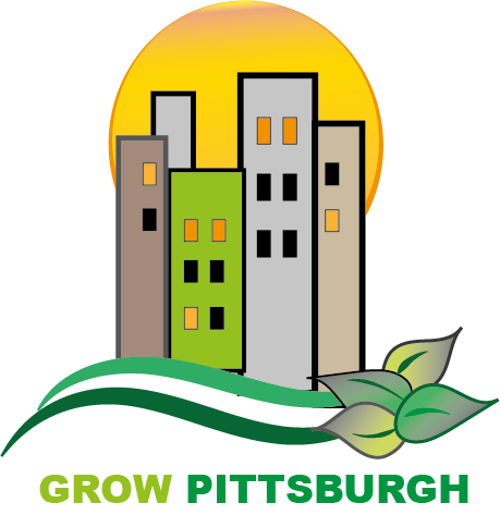
I wanted the logo to be simple yet leaves an impact on the viewer. The colours used signify a clear contrast between urban and rural environments.
The orange coloured sun in the background helps blending the high-rise buildings earthy coulours with that of the green leaves in the foreground giving a warm atmosphere.
Bibliography
Anon., 2021. urban farming initiaive-facebook. [Online]
Available at: https://www.facebook.com/urbanfarminginitiative1/?view_public_for=103442841480305
Anon., n.d. GROW PITTSBURGH. [Online]
Available at: https://www.growpittsburgh.org/about-us/
[Accessed 31 OCT 2021].
Anon., n.d. Urban Farming. [Online]
Available at: https://www.urbanfarminginitiative.org
[Accessed 31 oct 2021].